|
|
Comparisons of various ping "Jitter" measures Les Cottrell and Warren Matthews, Last Update: January 20, 1999 Central Computer Access | Computer Networking | Internet Monitoring | ICFA-NTF Monitoring | Tutorial on ping Internet monitoring |
|
 .
.
The next chart shows a scatter plot of the IQRs for Delay and IPDD from
January 8 - 20, 1999 between SLAC and CERN, CMU (Pitsburgh, Pennsylvania),
DESY and FNAL.
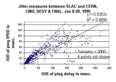
The red line is for y = x . The black line is a straight line fit
of the points. It can be seen that for small values the two measures are very
similar, but as the IQR of the ping delay exceeds 50 msec. the value of the
IQR of the ping IPDD levels off. The correlation is seen to be strong (i.e.
R2 > 0.6) even without taking into account the
dual behavior. A better fit to the above
data can be made with a power series with the
form y ~ 1.2x0.88 with an R2 = 0.96.
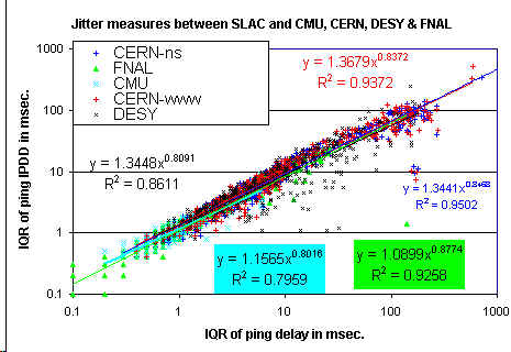
A chart showing the scatter plots for color-coded for each remote site
with log-log axes
and with power series fits (they are shown as colored lines which
overlay one another fairly completely so they are hard to distingush)
for the various remote sites is also seen together
with the parameters of the fits.
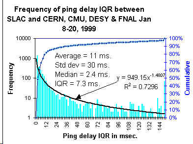
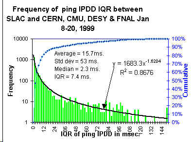
Histograms of the frequency of occurence for the delay IQR and the IPDD IQR are
seen in the charts below. The black lines are power series fits to the data with
the parameters shown. The blue line is cumulative percentile.
It can be seen that both distributions have heavy
tails.
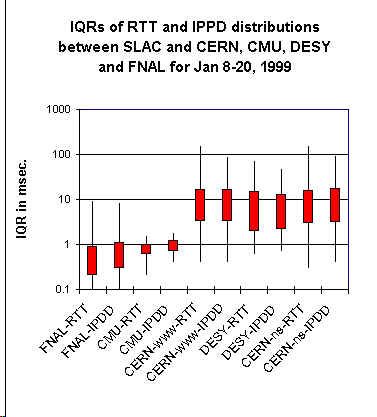
Below is shown a chart showing the minumum, 25%, 75% and 95% of the
distributions of the
IQRs for the 100 ping sample delays (RTT) and IPPDs for pings between SLAC and
CERN (2 hosts, one a WWW server, the other a name server), CMU, DESY & FNAL
measured between January 8 and 20, 1999 is shown below. The top of each thin line
is the 95%, the top of each box is 75%, the bottom of each box is 25% and the
bottom of each line is the minimum. Each point corresponds to about 570 samples.
Each sample corresponds to 100 pings, and the samples were taken at roughly
half-hour intervals.